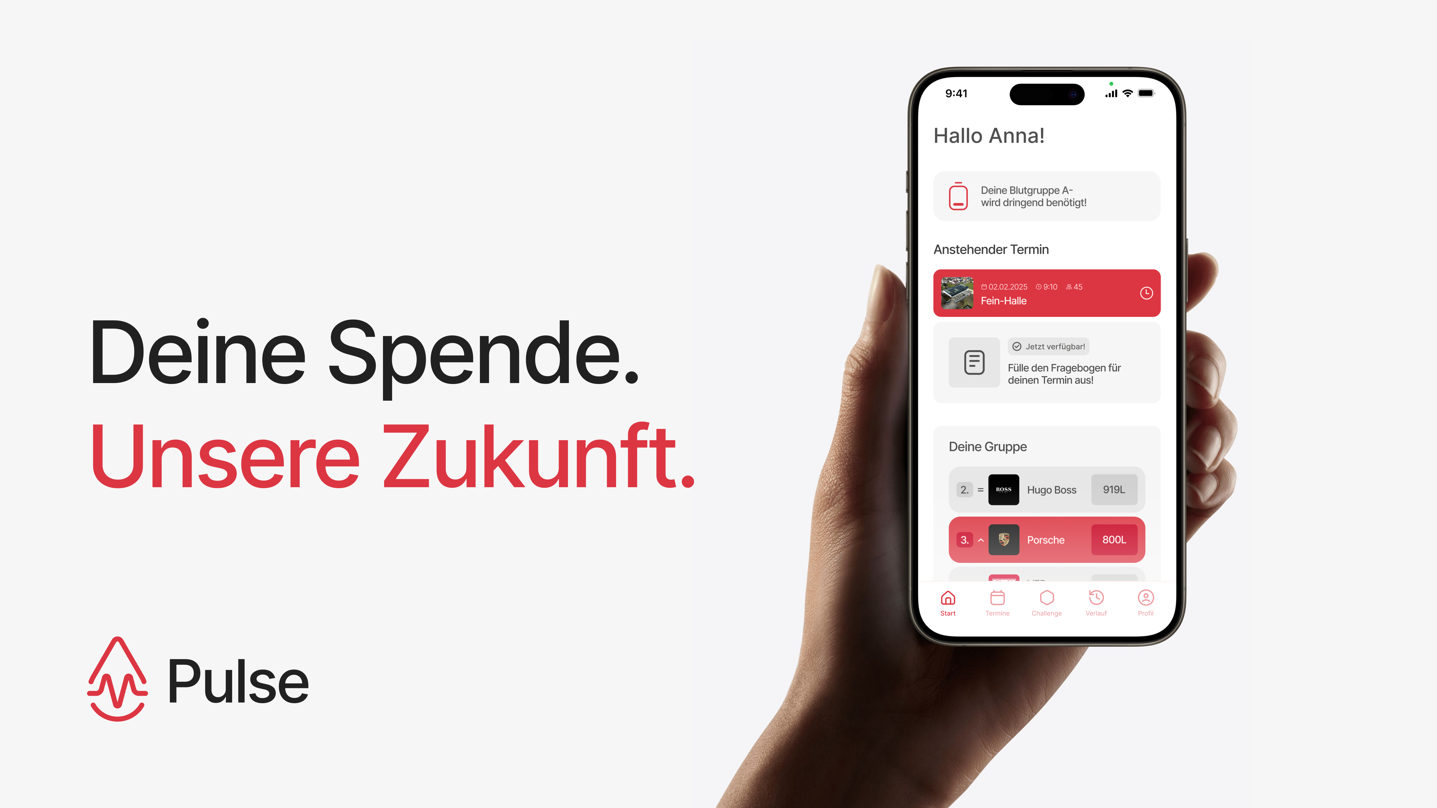
How Might We Encourage The Youth For Blood Donation?
Pulse is an app concept that closes the gap between wanting to donate blood and actually showing up. It turns willingness into booked appointments through clearer eligibility, light social motivation, and collective challenges that make donating feel less clinical and more shared.
Problem
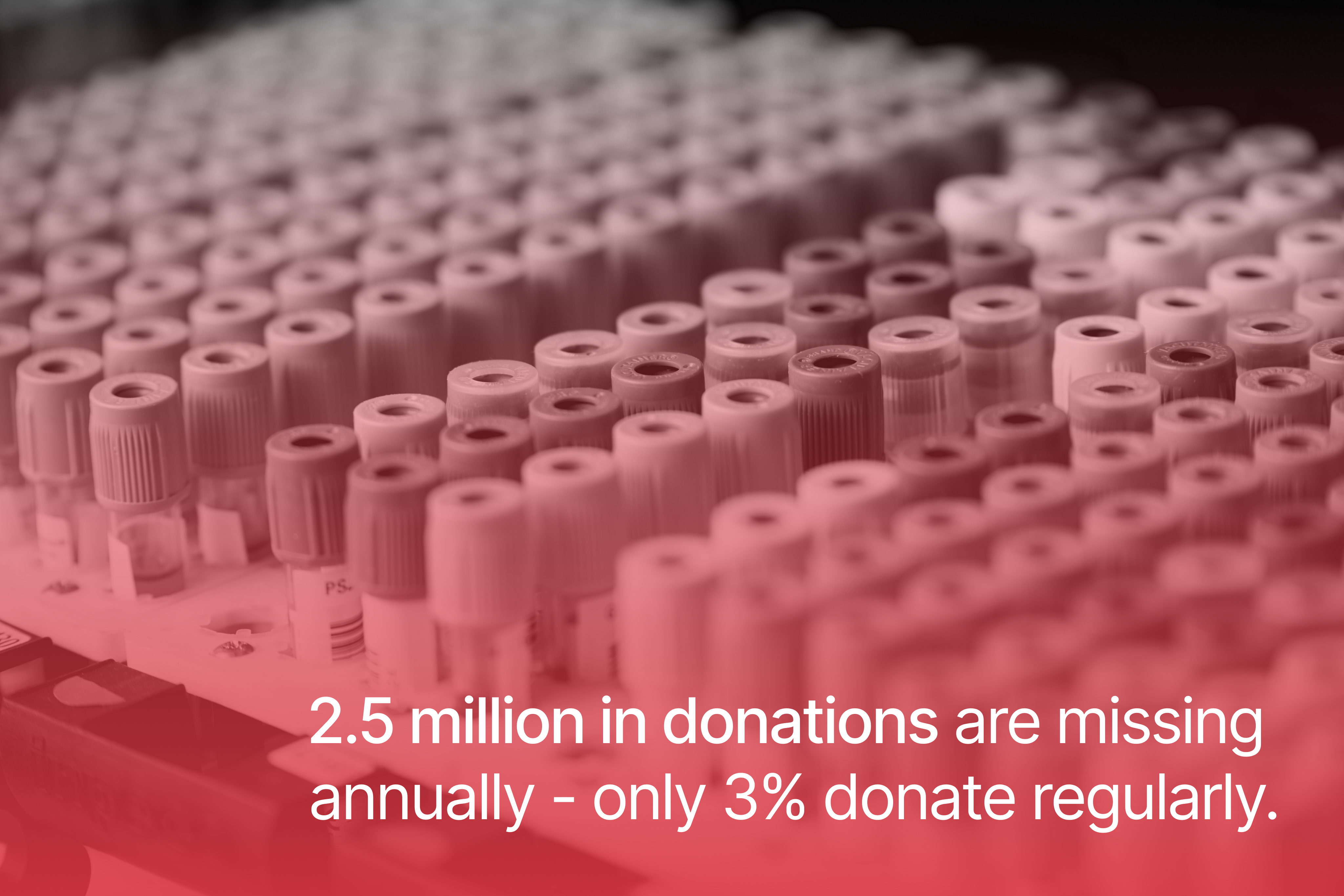
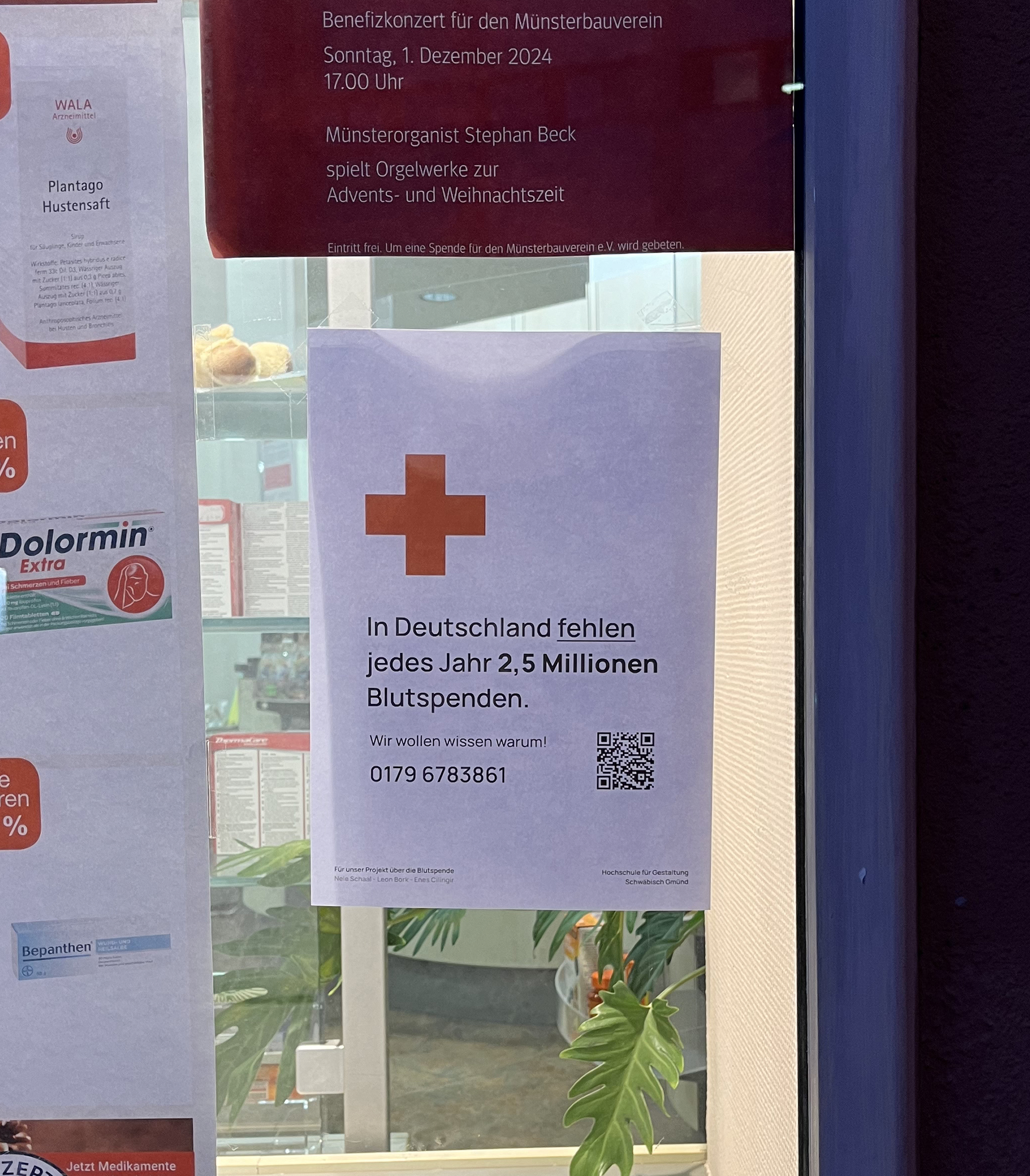
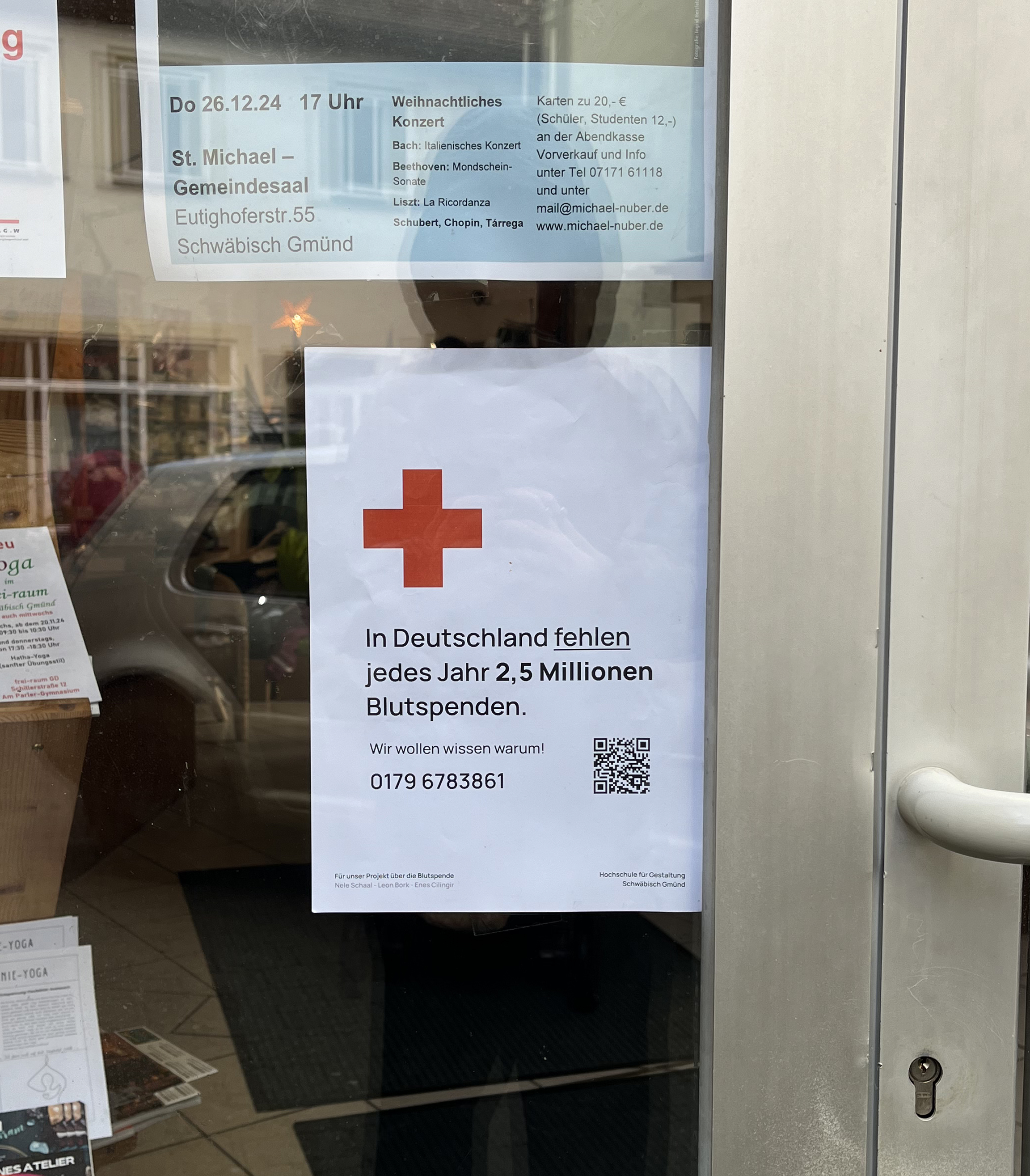
In Germany, there is an annual shortage of 2.5 million blood donations.
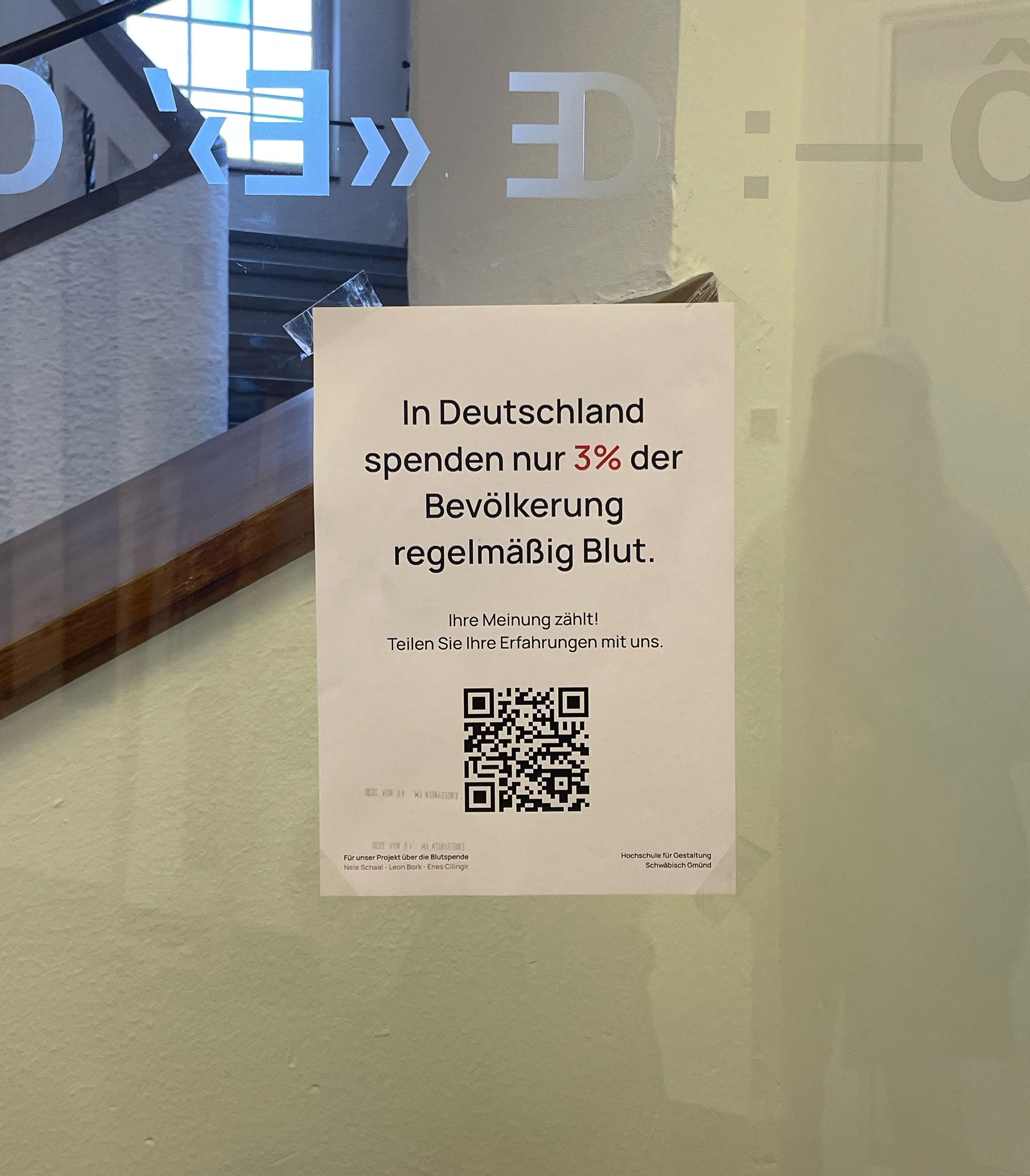
Only 3% of the population donates regularly. The average donor is 48 years old — the healthcare system depends on an aging pool of repeat donors.
Young people rarely participate. Blood donation is simply not part of their everyday lives.
Research
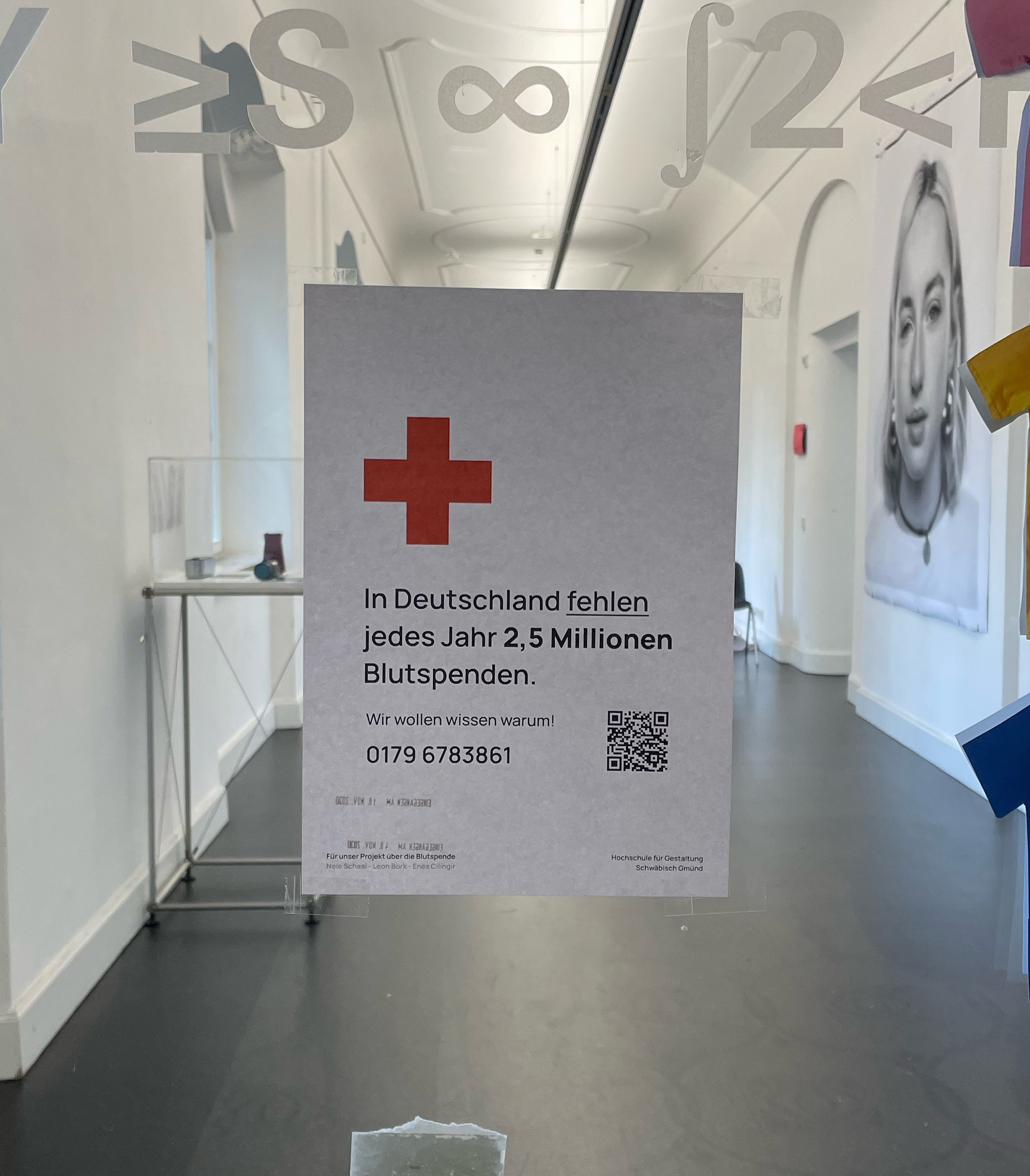
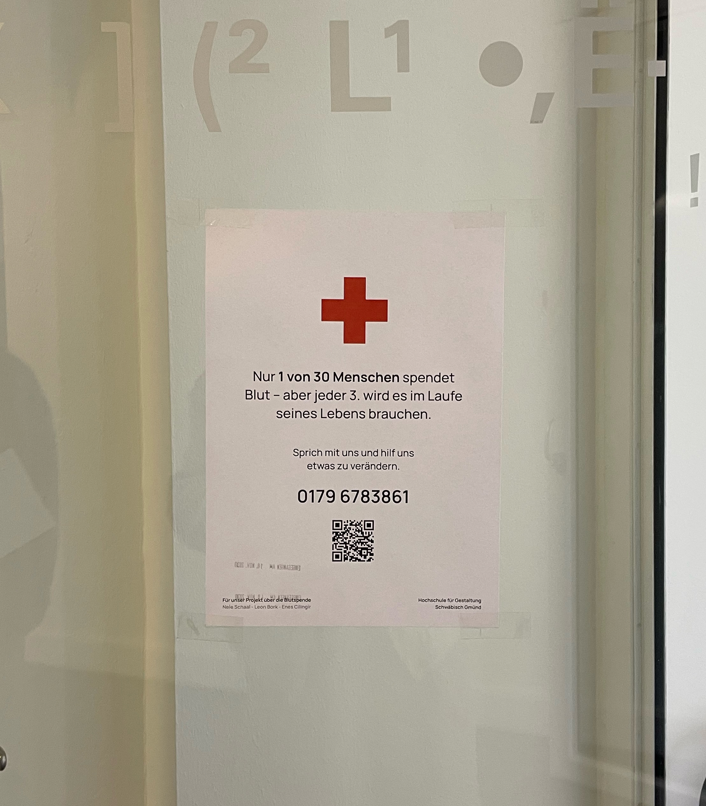
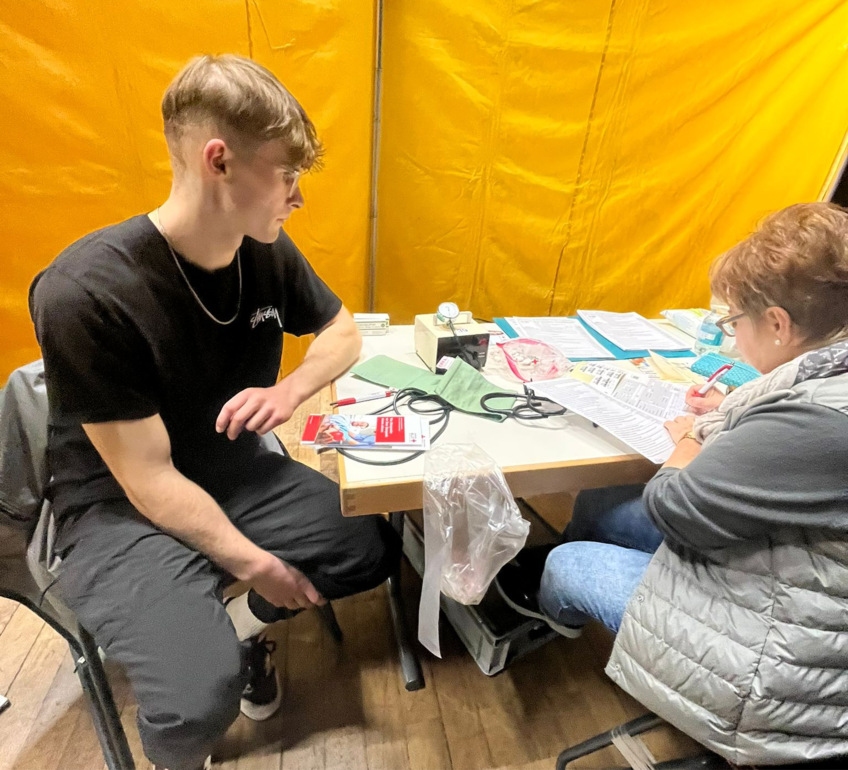
We wanted to hear directly from young people, not just our immediate circle. By putting up quick QR-code posters around our university campus and local spots in Schwäbisch Gmünd, we made it as easy as possible for them to jump straight into our survey.
While 76% express a strong willingness to donate, 54% are stopped by uncertainty about basic eligibility rules. The intention is there, but the knowledge is missing.
The core issue is an intention-action gap. High willingness to help simply never translates into a booked appointment.
Almost zero awareness of the existing Red Cross app confirmed our hypothesis: before we can optimize usability, we must fix visibility.
Framing
With the systemic barriers exposed, we translated our research into three non-negotiable design challenges.
How might we eliminate administrative friction to make donating the path of least resistance?
How might we transform an invisible clinical duty into an emotional, habit-building experience?
How might we proactively demystify eligibility rules so users never have to guess if they can help?
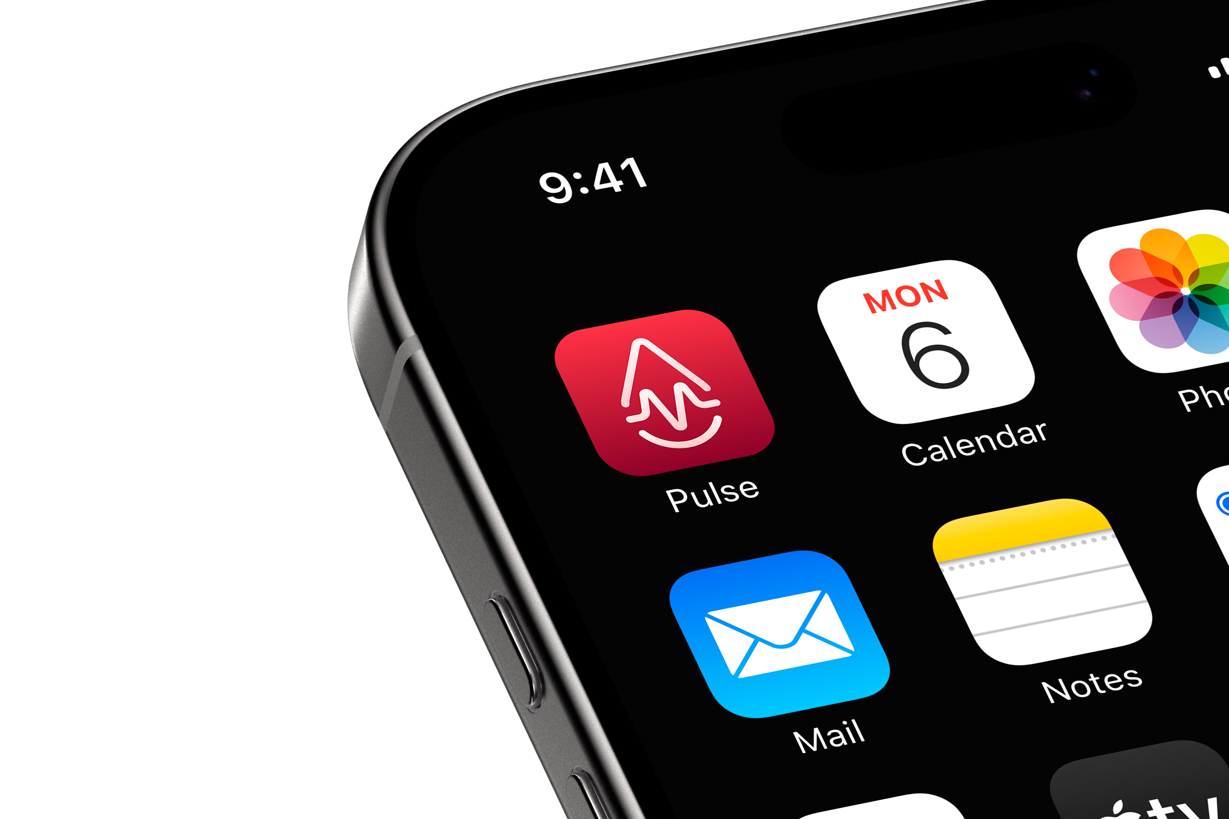
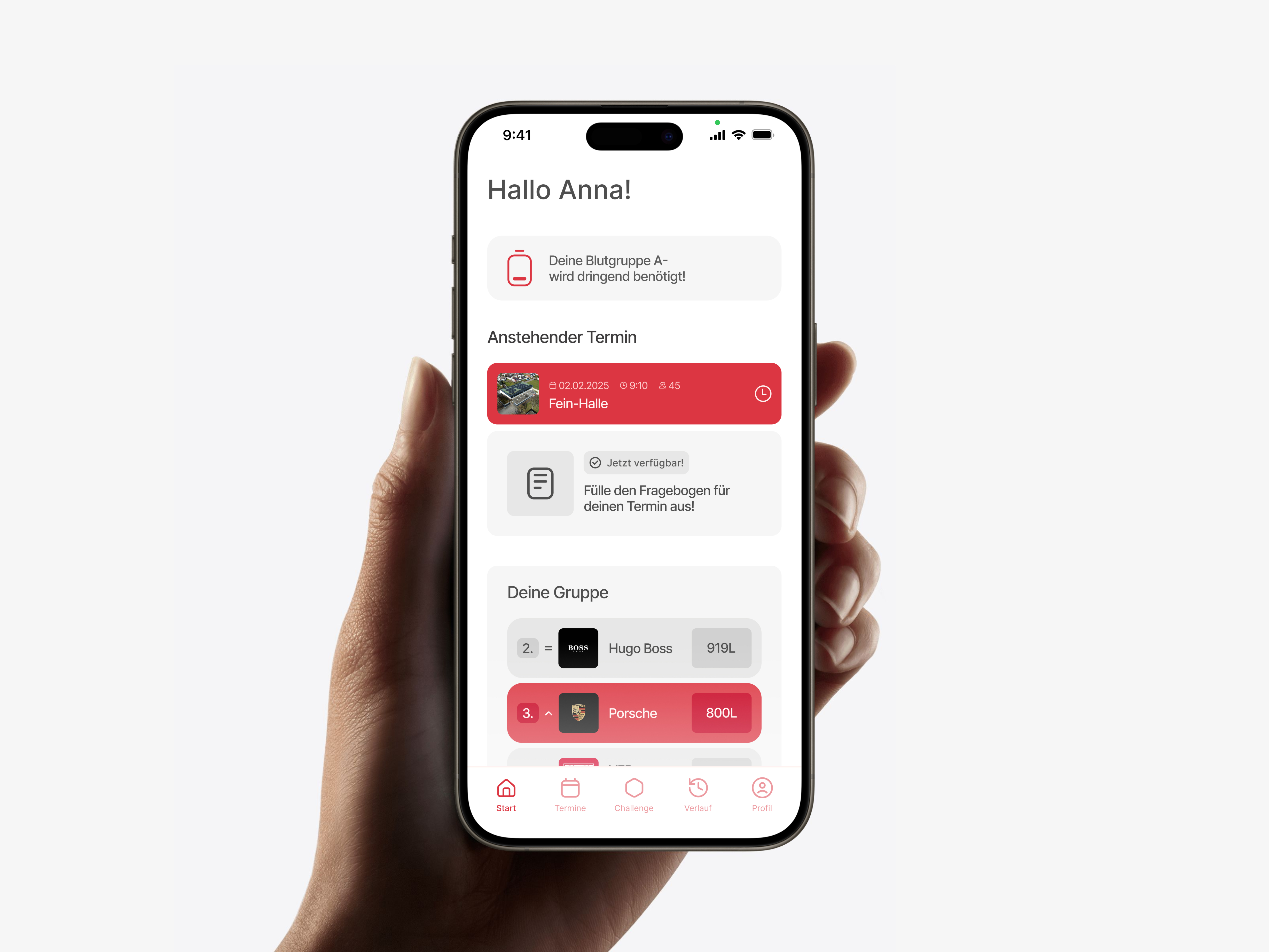
Designs
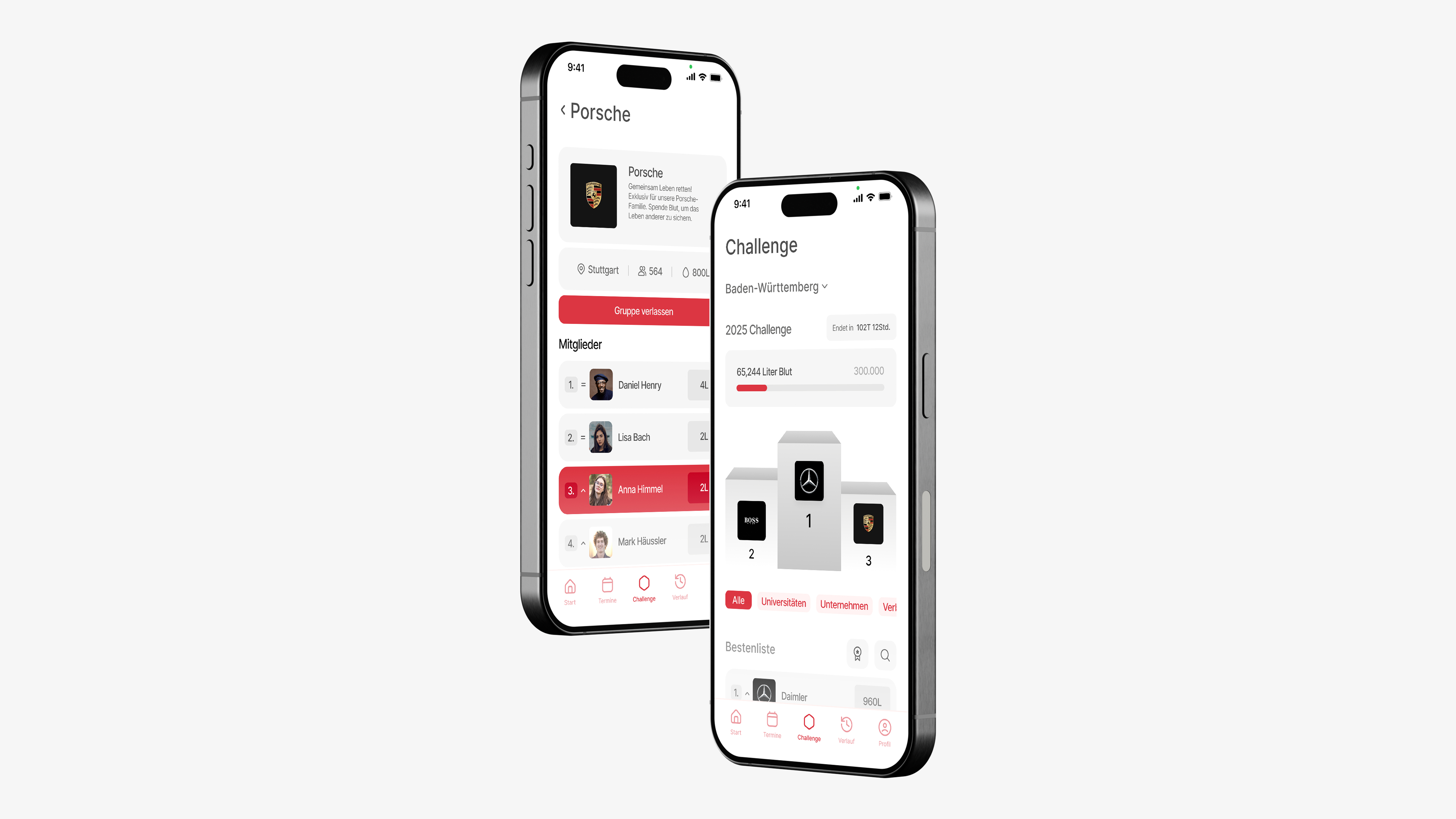
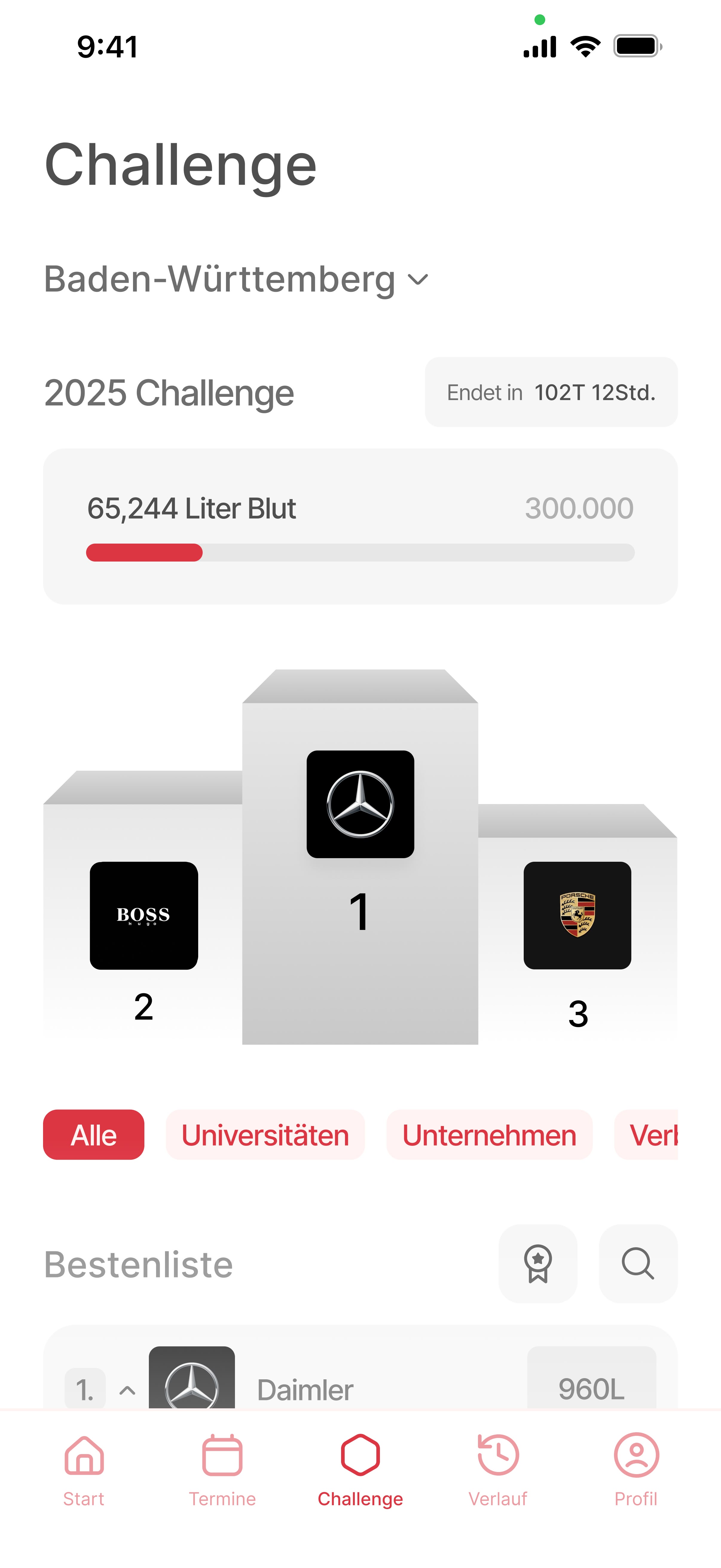
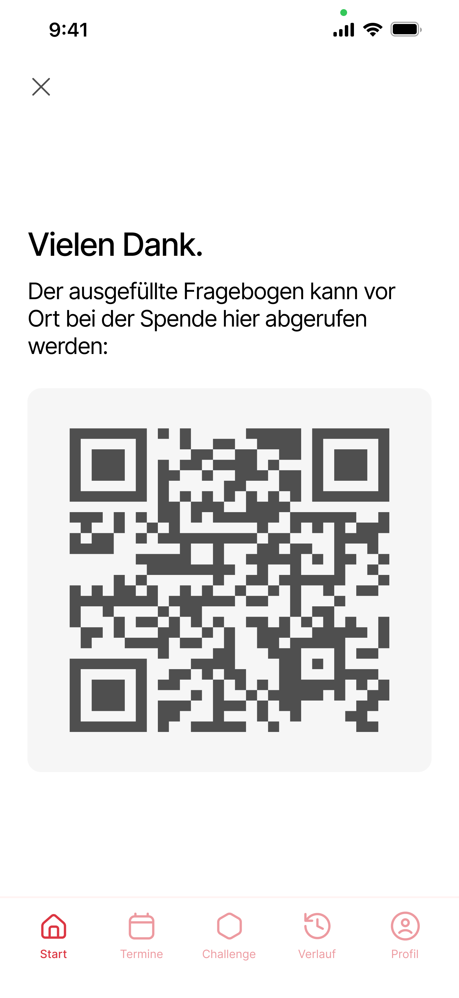
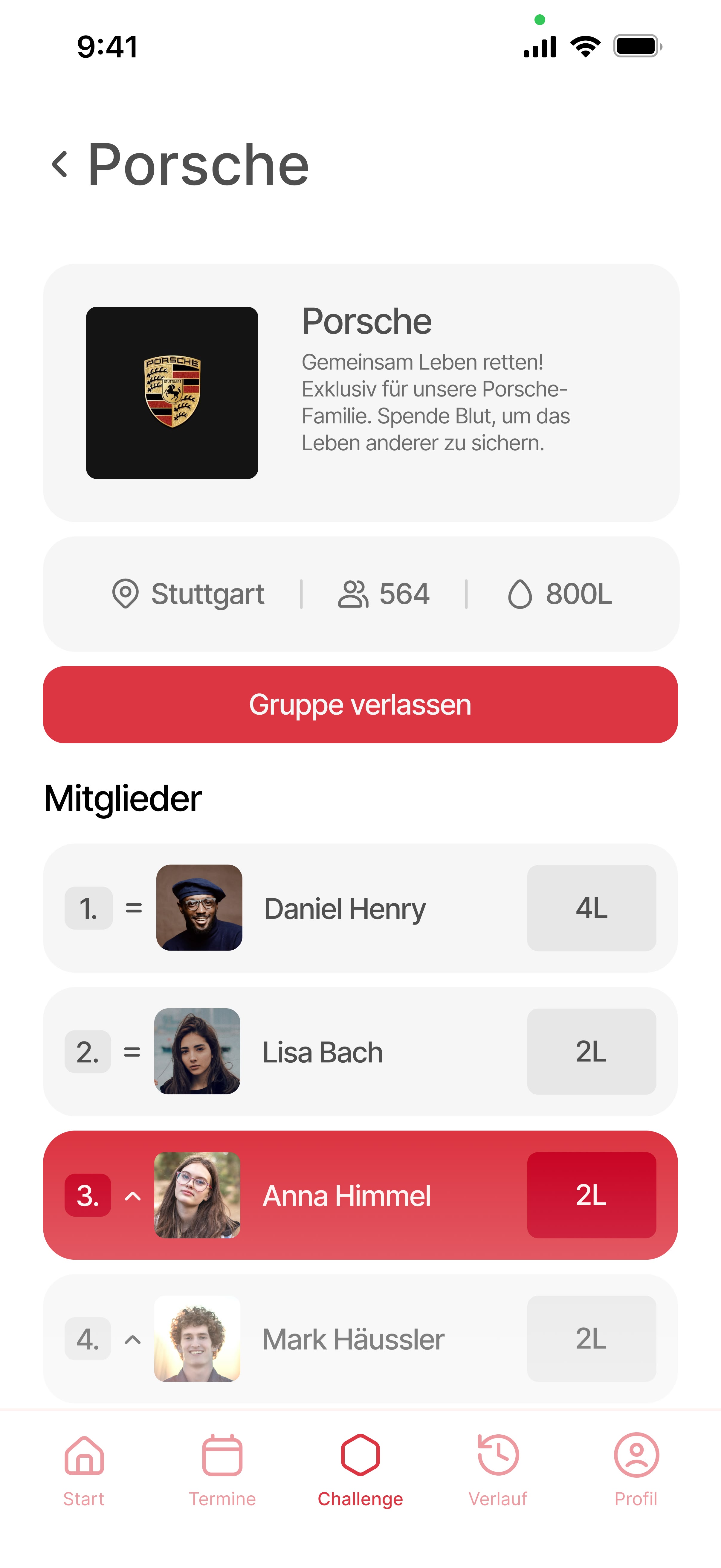
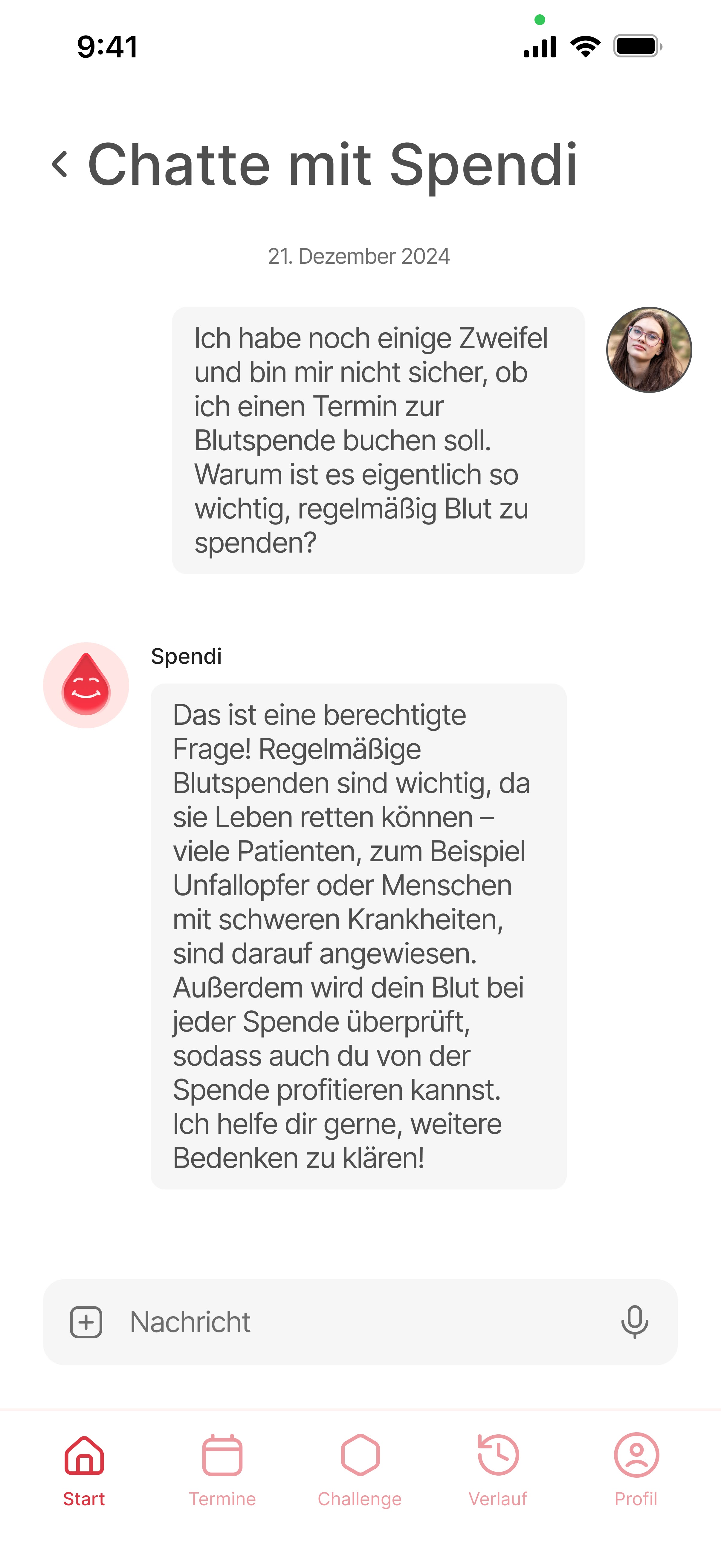
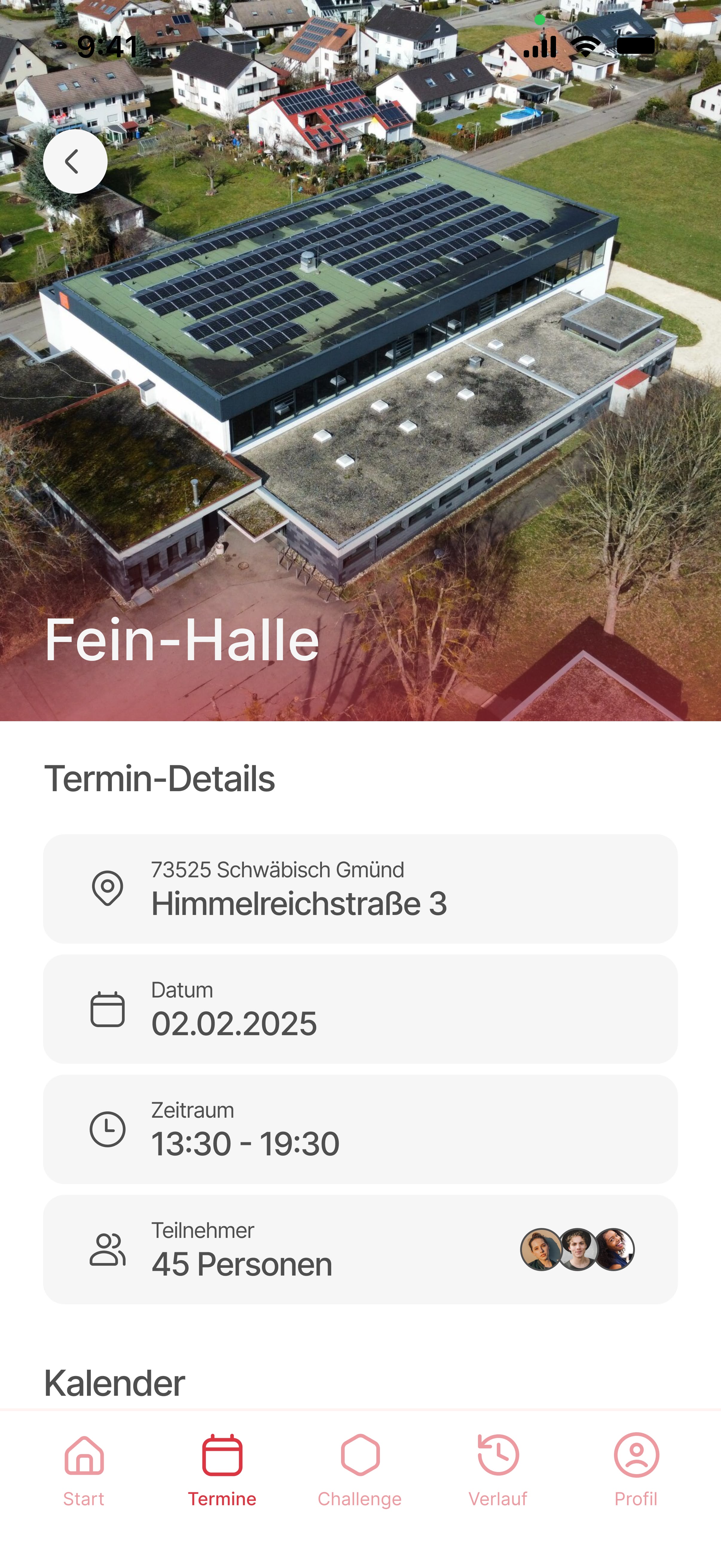
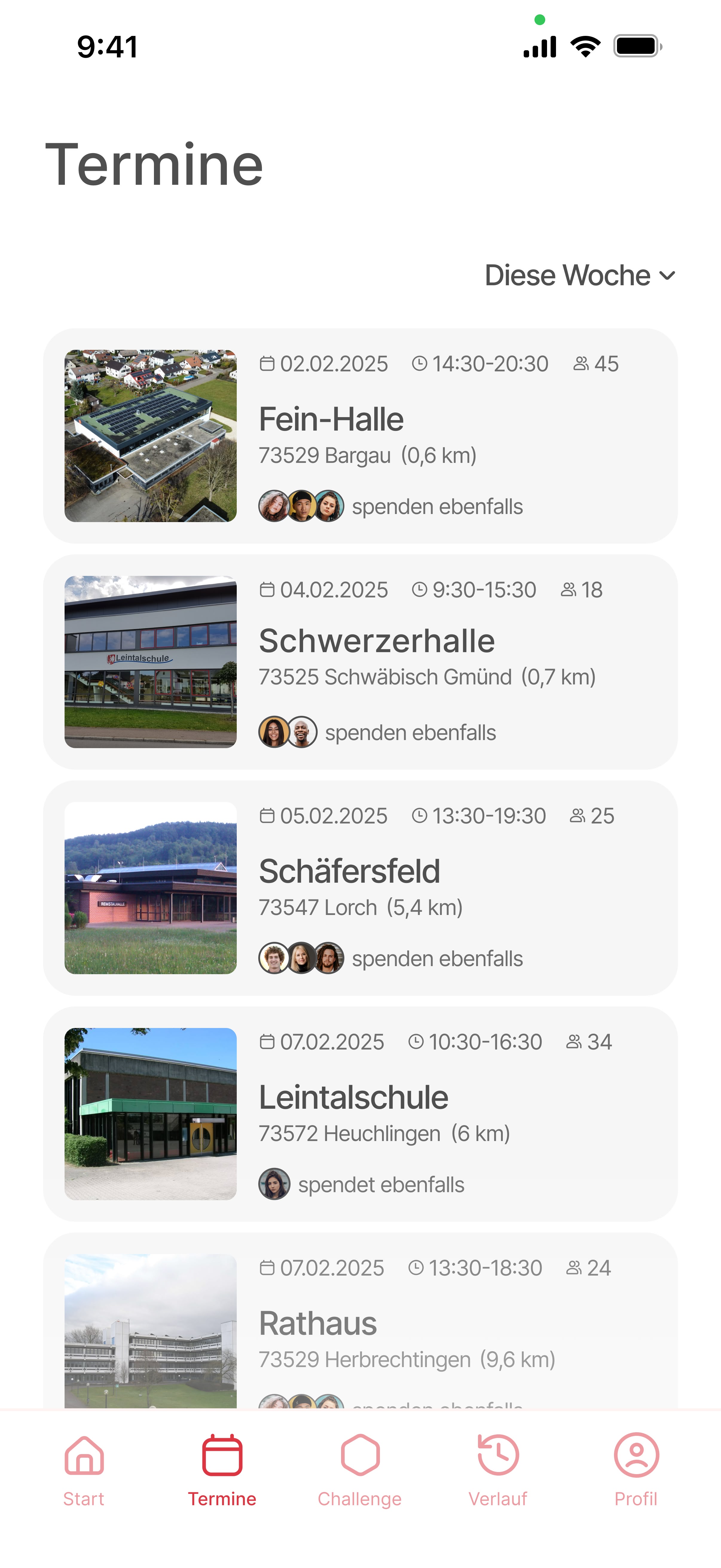
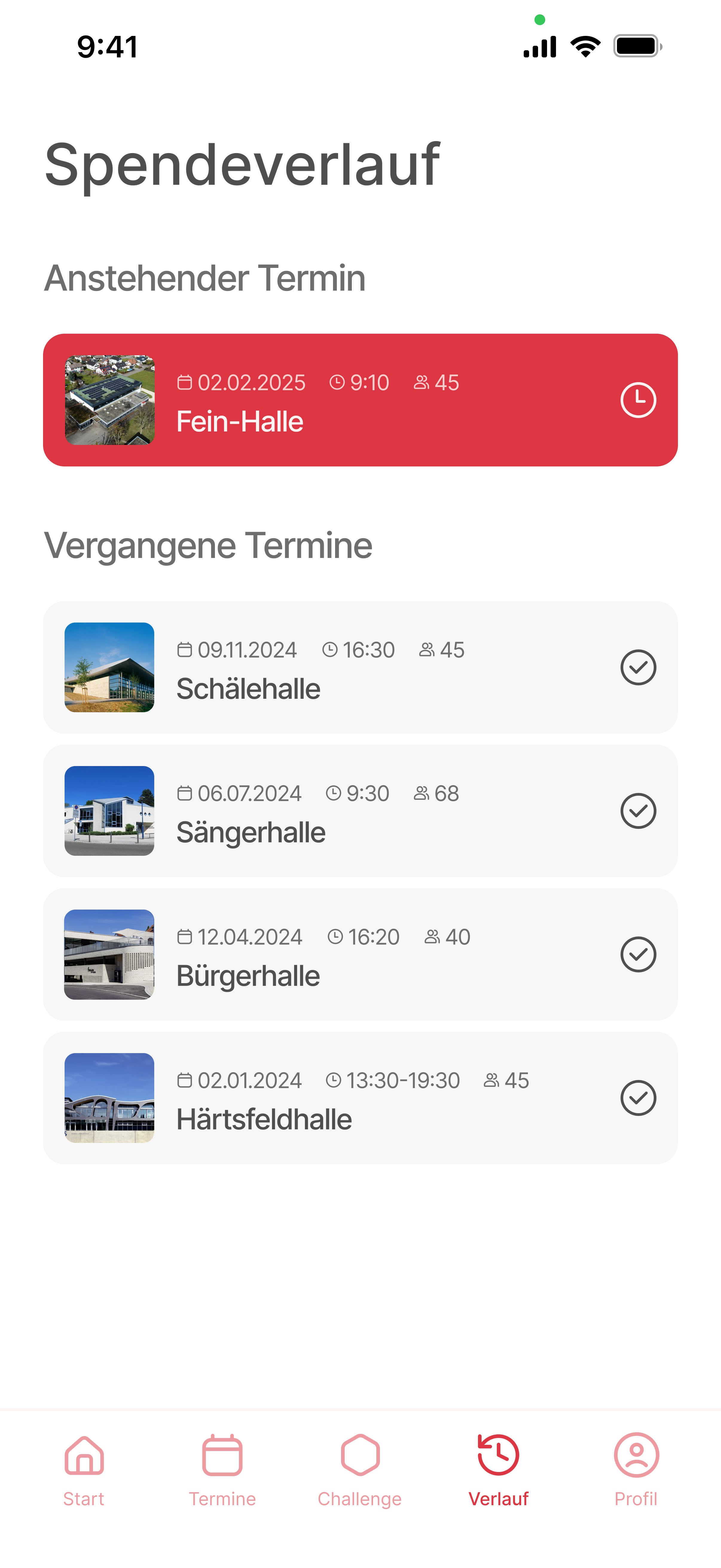
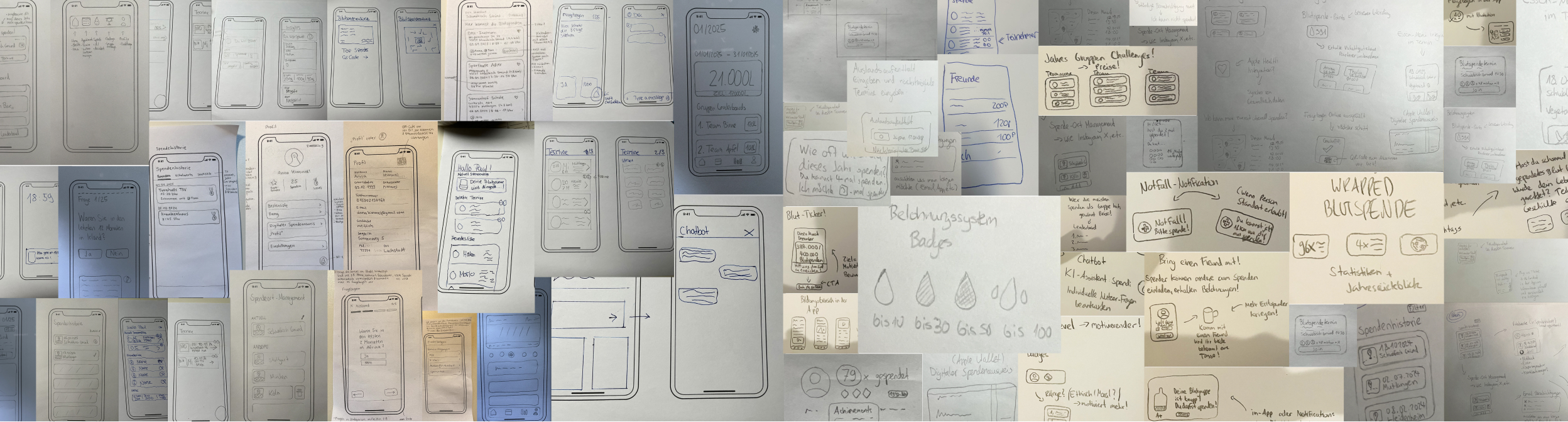
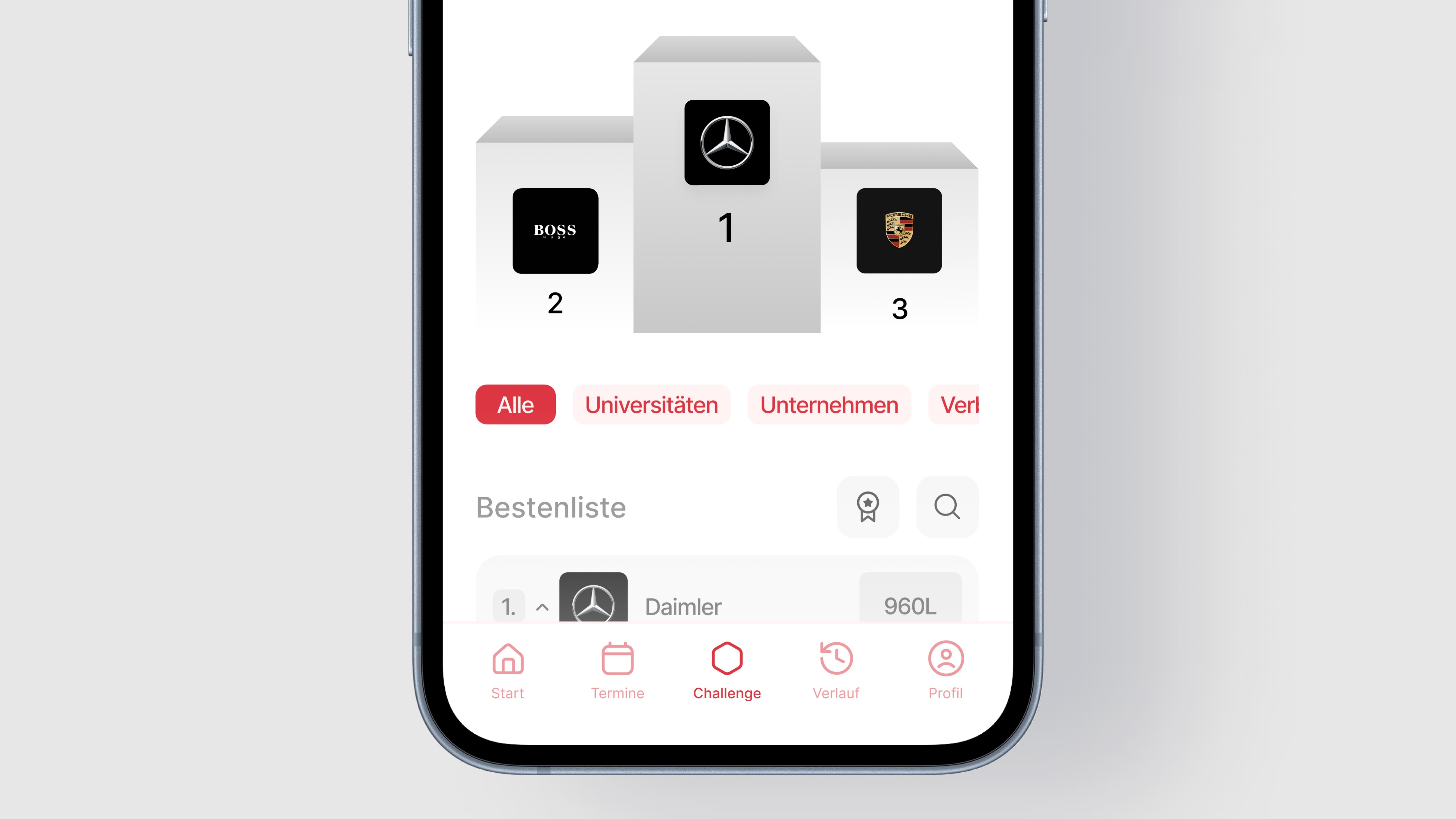
The final interface brings collective challenges, eligibility checks, scheduling, and donation history into one coherent flow.
Designed to feel social, legible, and low-friction on a phone.
Takeaways
We didn't start with the youth in mind. We wanted to know why blood banks are constantly empty.
The deeper we dug, the clearer the gap became: a generation willing to help, ignored by how the system communicates.
We don't need to convince young people to care. We need a system that works for them.
Pulse removes guesswork around eligibility and strips away intimidating paperwork — turning an outdated medical duty into a straightforward, shared habit.
How Might We Encourage The Youth For Blood Donation?
Pulse is an app concept that closes the gap between wanting to donate blood and actually showing up. It turns willingness into booked appointments through clearer eligibility, light social motivation, and collective challenges that make donating feel less clinical and more shared.

Problem
In Germany, there is an annual shortage of 2.5 million blood donations.
Only 3% of the population donates regularly. The average donor is 48 years old — the healthcare system depends on an aging pool of repeat donors.
Young people rarely participate. Blood donation is simply not part of their everyday lives.
Research
We wanted to hear directly from young people, not just our immediate circle. By putting up quick QR-code posters around our university campus and local spots in Schwäbisch Gmünd, we made it as easy as possible for them to jump straight into our survey.
While 76% express a strong willingness to donate, 54% are stopped by uncertainty about basic eligibility rules. The intention is there, but the knowledge is missing.
The core issue is an intention-action gap. High willingness to help simply never translates into a booked appointment.
Almost zero awareness of the existing Red Cross app confirmed our hypothesis: before we can optimize usability, we must fix visibility.

Framing
With the systemic barriers exposed, we translated our research into three non-negotiable design challenges.
How might we eliminate administrative friction, build emotional habit, and demystify eligibility—so donating becomes the path of least resistance?
Mapping the complete journey helped us connect marketing touchpoints, digital flows, and on-site experiences from first awareness through post-donation engagement.
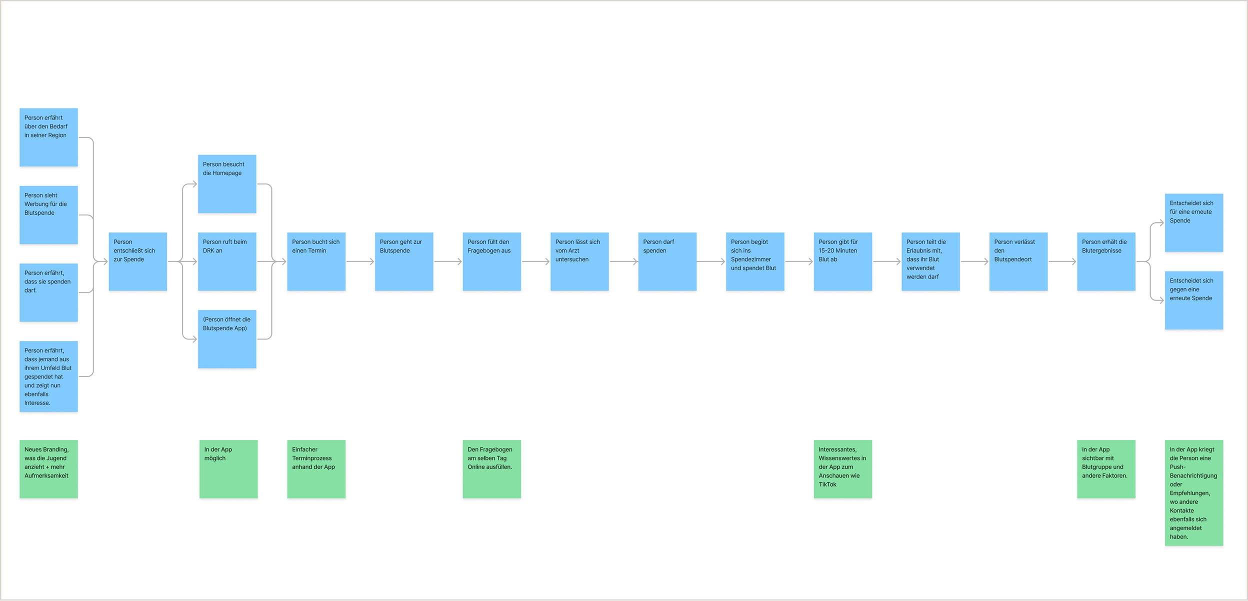
Final designs
Designs
The final interface brings collective challenges, eligibility checks, scheduling, and donation history into one coherent flow.
Designed to feel social, legible, and low-friction on a phone.
Takeaways
We didn't start with the youth in mind. We wanted to know why blood banks are constantly empty.
The deeper we dug, the clearer the gap became: a generation willing to help, ignored by how the system communicates.
We don't need to convince young people to care. We need a system that works for them.
Pulse removes guesswork around eligibility and strips away intimidating paperwork — turning an outdated medical duty into a straightforward, shared habit.